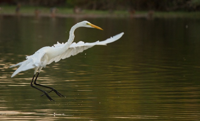
It’s great to have a riparian reserve area so close to us. When I first got my camera, I spent several days sitting down at the ponds trying to take as many pictures as I could of the birds there. It’s kind of funny to look back at my pictures from only a month ago and see all the things I would change now since I’m so much more advanced :) . One “highlight” that I’ve learned since then is that it is typically best to expose for the highlights. Unless, of course, you don’t want that. These cranes are fascinating to watch. This one was doing a dance of some sort. Jumping around, flying short distances, and then finally plunging into the water to catch a small fish.

Many of my pictures ended up overexposed on the white cranes because I metered off the darker backgrounds. I’m learning… slowly.
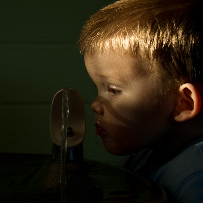
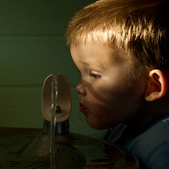
Here is one of Simon that I played with to try and recover some of the dark areas, since I did it the right way and exposed for the highlights on his face. The sun coming through the window was like a spotlight on his face and everything else went dark. I liked the darker picture, but you couldn’t tell as well what he was looking at. What do you think? The first one is the original darker image. The second one I used fill light to bring back the dark areas a bit.


3 comments:
I love the darker one, but I can't tell you why. I think you can still tell what he's looking at, but it is very unique! Ginny
I love them both. That subject is cute no matter what! But I think I do like the darker one best.
It's unanimous then. We all like the darker one. I like the screen shadows on his face.
Post a Comment